Hello all. It's another Tuesday and that means Top Ten Tuesday which is a meme created by The Broke and the Bookish. For this week the topic is Top Ten Covers we Wish we could Redesing. So here we go:
Mostly these have another covers and edition but these I picked I really dislike.
I'd love to see your picks too so feel free to link them up in comments below.
Until the next time,

Mostly these have another covers and edition but these I picked I really dislike.
I'd love to see your picks too so feel free to link them up in comments below.
Until the next time,


I actually like Iced, even though I disliked the book. And I think the Jellicoe Road cover somehow fits the quiet beauty of the story. But the Kinslayer cover is absolutely dreadful, what the heck were they thinking anyway? the US cover is appealing, but this is an embarassement.
OdgovoriIzbrišiI haven't read the book yet, but I really don't like that cover. I wonder that everyday. Stormdancer wasn't that bad, but Kinslayer is really awful.
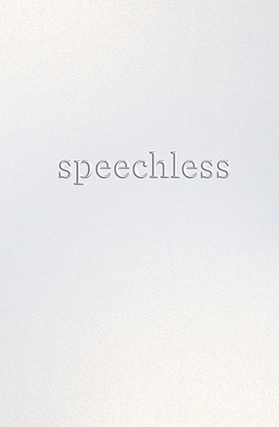
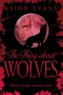
IzbrišiVampire Academy does have too stereotypical covers. I loved Stephanie Perkins covers much better before redesign - those couple sitting on benches were so cute. Speechless always makes me think that cover needs yet to be revealed. :D I think the most awful of the batch is The thing about wolves... so ugly. :/
OdgovoriIzbrišiYes I loved the old covers for Stephanie's books. Yeah I guess it's too black.
IzbrišiDefinitely Speechless and Iced, not to mention Kinslayer has better editions, but I think the Falconer is a fairly fierce cover (not AS good as the UK cover of course!) and Isla...I like the new cover, but wish they had stuck to the old ones. And VA definitely needs to be changed. Great list, Tanja!
OdgovoriIzbrišiIt does have better editions, but this one is terrible. I wish they did. Thanks Keertana :)
IzbrišiI remember thinking that Speechless cover was just a placeholder at first. I'd probably change it too! I do like the new Isla covers actually, but like Keertana mentioned, it would have been better to see them stick with the originals. Great choices, lovely! :)
OdgovoriIzbrišiYeah it'd have been better. Thanks dear :)
IzbrišiI actually don't mind the Iced cover but all the others I completely agree on!
OdgovoriIzbrišiIt seems to me I'm the only one :D
IzbrišiI would have to agree with you, especially Speechless. It looks like a manual.
OdgovoriIzbrišiIt maybe has point but still...
IzbrišiNormally I'm all for really simplistic covers, but Speechless just looks unfinished. I get it's supposed to be minimalist, but it looks like it should have "cover not final" written across it. Iced isn't my favorite cover either, but I love Burned. The orange and gold are so pretty:)
OdgovoriIzbrišiYeah I was really surprised when I fist saw it. Yeah Burned is pretty :)
IzbrišiI love the cover of ICED. I think Speechless could use a better cover.
OdgovoriIzbrišiI will have to get a closer look at it :)
IzbrišiI like Speechless, because sometimes simple really speaks a lot. however, I can see how another cover might be better.
OdgovoriIzbrišiMaybe if the letters were in different color or something. I don't know..
IzbrišiI really like the cover of Iced, but I can see the rest needing changed. I guess maybe Speechless was looking to make a point, in reference to the title? Vampire Academy could definitely use a better cover, its' such a great series.
OdgovoriIzbrišiThanks for sharing!
I guess it did. Yeah too bad it was badly designed. Thanks :)
IzbrišiAw, hon! You don't like Iced and Isla? :( I really like the new covers for Stephanie Perkin's books. I didn't like the cheesy original ones even though I do own a paperback of Anna's book, however, I do wish that they'd kept the original design for the hardcover since so many fans are frustrated with the "don't match" cover thing. I love the new design though. As for VA? OMFG. Richelle Mead has the worst luck with covers. They suck. Bad!!! I like the UK version of VA series. Some of the covers that I adore are OCD-Love Story for instance and... Taken by Erin Bowman? That's a great one (though I've yet to read the story and I don't think I will based on the reviews and the guy MC that everyone hates) or How to Love etc. I love a good typography cover with gorgeous colours:) Thanks for sharing, cupcake!
OdgovoriIzbrišiI liked the cheesy ones xD I totally agree, I wanted to post more covers for her books, but that would be cruel :) Yeah I love that one! Thanks dear :)
IzbrišiI'm surprised you chose Jellicoe Road since we know how much you like the author and story. I actually really like Vampire Academy (the first series cover at least), Isla, and The Falconer. I could still see a really cool redesign for the Falconer. And Speechless... yes. That could definitely be better lol.
OdgovoriIzbrišiI adore that book, but I cannot say that the cover is the best. Thanks Andriana :)
IzbrišiYeah the U.S. version rocked! :) Thanks Heidi :)
OdgovoriIzbrišiYES to the vampire academy covers! I would love for them all to be redesigned. And I love the US version of Stormdancer. The UK version is kind of disappointing. Great list!
OdgovoriIzbrišiYeah I adore the US version too! :) Thanks :)
IzbrišiI actually like the cover of Speechless. I don't know what the book is about but the cover seems pretty apt to me. I also feel that the new Lola cover is pretty. I agree with the rest though. They could undergo some major redesign. Great list, girl.
OdgovoriIzbrišiSarika @ The Readdicts
Yeah it fits the title, but still too plain for my taste. Thanks girl :)
IzbrišiI so agree with VA, I really love that book but the cover is just ehhh!
OdgovoriIzbrišiTeresa @ Readers Live A Thousand Lives
Yeah, the whole series is great, but not the covers. :)
IzbrišiI agree with the VA covers, they are kind of lame. And I don't like the new covers of the Stephanie Perkins books. The rest of them I like pretty well though.
OdgovoriIzbrišiI so should have done this topic. lol Totally agree on a bunch of these. Not happy with the ISLA cover. These are fun and cute books for YA readers, not adult mysteries. And I was disappointed when I saw the Heartbeat cover. They could have done so many other clever things that pertained more to her mom than the typical romance vibe you get here.
OdgovoriIzbrišiYes, and I liked the ARC one better :( Thanks Sara :)
IzbrišiI don't. I loved the covers for Fever series better. Yeah thank god. I forgot Origin though. Thanks Aman :)
OdgovoriIzbriši